In This Article
- The Escrow Shock Reshaping Client Conversations
- Why Visualization Beats a Spreadsheet at the Closing Table
- Building a Combined Payment Trends Dashboard
- Mortgage BI and MortgageExchange: A Purpose-Built Mortgage Data Stack
- Turning Data Into Better Client Conversations
- How Mortgage Workspace Builds These for Lenders
- Frequently Asked Questions
Median monthly escrow costs jumped from $334 to $419 between 2019 and 2024, a 25% increase that pushed property taxes and insurance from background line items to the dominant variable in many borrowers' monthly payments. By early 2026, Cotality reported that escrow alone made up more than 40% of the total monthly mortgage payment in many US markets. And in a 2025 Lereta escrow awareness survey, 55% of homeowners said they had been surprised by a payment increase in the previous two years.
For loan officers, mortgage brokers, and originators, those numbers are not abstract market data. They are the moment a borrower calls fourteen months after closing and says, "My payment went up $280. You never told me this could happen." Every escrow surprise is a referral lost, a relationship damaged, and a servicing complaint waiting to file. The borrowers who feel ambushed are the same ones who refinance with a competitor and tell three friends about the experience.
Visualizing combined tax and mortgage payment trends is how forward-looking lenders close that gap. When a borrower can see how principal, interest, taxes, and insurance interact across a 30-year horizon, the conversation shifts from "Why did my payment go up?" to "Here is what my year-five payment will look like under three scenarios." This guide shows how mortgage shops build those visualizations using Mortgage BI, Mortgage Workspace's purpose-built business intelligence layer for mortgage portfolios, fed by MortgageExchange, the data layer that unifies servicer feeds, escrow data, and tax disbursements into a single queryable source.
The Escrow Shock Reshaping Client Conversations
A fixed-rate mortgage was never a fixed monthly payment, but for most of the past two decades the gap between the headline rate and the all-in cost was small enough to ignore. That assumption is now obsolete for borrowers and for the loan officers who serve them.
Cotality's January 2026 property market analysis found that escrow now exceeds 40% of total monthly mortgage cost in many US markets, with several states (Nebraska, Kansas, Wyoming) seeing escrow components rise more than 50% since 2019. The National Association of Realtors confirmed the longer arc in its 2025 Escrow Effect study: combined property taxes plus homeowners insurance climbed from $334 to $419 a month between 2019 and 2024 nationally, with insurance alone up 41% and property taxes up roughly 20% over the same five years.
Insurance is the loudest signal. According to Bankrate's 2025 study of 30,000+ ZIP codes, average annual homeowners insurance premiums reached $3,548 in 2025, a roughly 70% jump from 2021 levels. Cotality projects another 8% national increase in 2026 as carriers continue to price in catastrophe exposure. A borrower who closed in 2023 is now seeing a second or third escrow analysis cycle, and many will be blindsided.
Why Originators Feel This First
The borrower never blames the tax assessor. They never blame the insurance carrier. They blame the person who sold them the loan. Every escrow surprise lands first in the loan officer's inbox or voicemail, regardless of who actually services the loan. A dashboard that shows the borrower their projected total payment under conservative, moderate, and aggressive scenarios at application is the cheapest insurance against that call fourteen months later.
Why Visualization Beats a Spreadsheet at the Closing Table
The standard initial escrow disclosure form and the annual escrow statement tell a borrower the numbers. They do not tell a story. A standard amortization schedule shows principal and interest declining over time and treats taxes and insurance as static line items. That model worked when reassessments moved 2 to 3% a year. It does not work when insurance carriers raise premiums 20 to 50% in a single adjustment and a single county tax reassessment can add hundreds of dollars to a monthly payment.
The Lereta 2025 Escrow Awareness Survey found that nearly half of homeowners said a 10% increase in their monthly mortgage payment would be a hardship. Forty-five percent still believed, incorrectly, that a fixed-rate mortgage payment cannot change. Sixty-eight percent said they had experienced a payment increase in the past two years.
An interactive chart that separates principal, interest, taxes, and insurance into stacked layers across a 30-year horizon gives a borrower something a printed disclosure cannot: an immediate visual of where their money goes and how it shifts. They can see that their note rate stays flat while their escrow climbs. They can see the crossover point where escrow exceeds principal repayment in some states. And they can see how their year-10 payment looks under conservative, moderate, and aggressive escrow growth assumptions.
The borrower who feels informed at application is the same borrower who refers their cousin instead of filing a complaint at year five.
This is not about prettier closing packages. It is about preventing the financial shock that drives servicing complaints, lost referrals, and the slow erosion of trust in your shop. For independent mortgage banks and broker shops, that trust is the franchise. The visualization is what makes the conversation real.
For shops that also want to communicate compliance posture alongside the borrower-facing numbers, our companion piece on visualizing presumption-of-compliance metrics in Power BI covers the same data plumbing pattern applied to compliance reporting.
Building a Combined Payment Trends Dashboard
Gather the right data sources
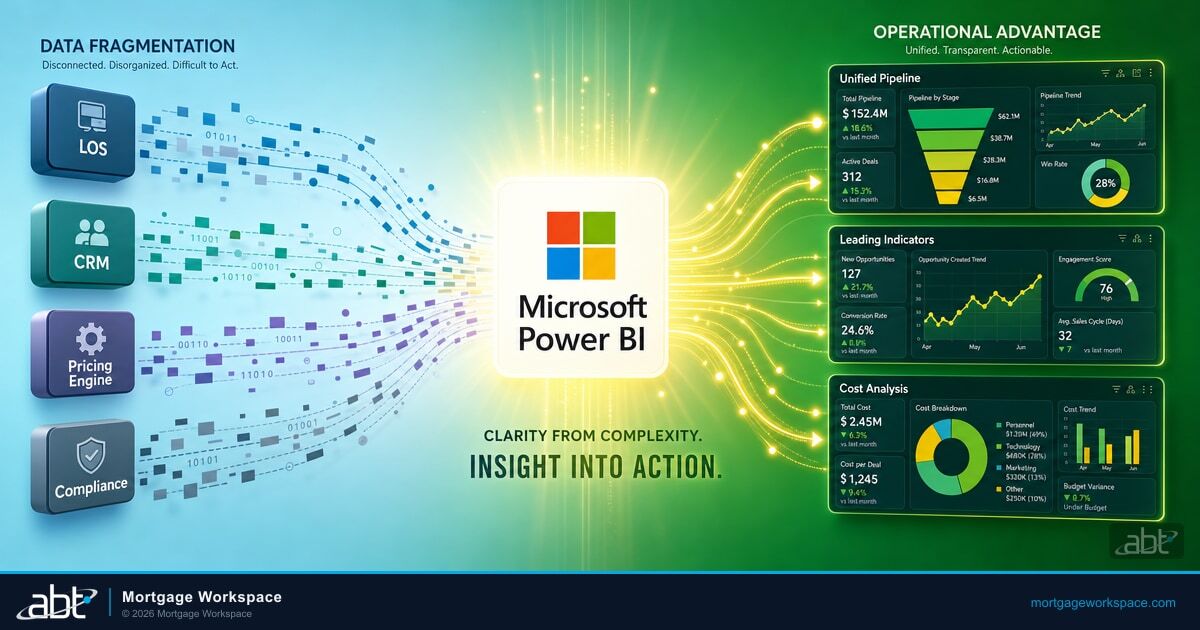
Start with loan terms from your origination platform: amount, rate, term, closing date, and current escrow balance. Layer in property-specific data: assessed value, current effective tax rate, current insurance premium. For projections, pull historical tax rate changes from county assessor APIs and state-level insurance trend data from departments of insurance. This is the step where most shops stall, because the data sits in five different systems that do not talk to each other. MortgageExchange solves the plumbing problem by unifying loan-origination feeds, servicing data, escrow disbursements, and county-level tax data into a single queryable layer that Mortgage BI reads from.
Structure an amortization model with adjustable assumptions
Build an amortization table that includes a row per payment period and columns for principal, interest, projected property tax, projected insurance premium, total monthly payment, and remaining balance. Apply annual growth assumptions to the tax and insurance columns. The single most important design choice is making those growth rates adjustable. A 2% annual property tax increase produces a very different 30-year picture than a 6% increase. Your dashboard should let a loan officer toggle scenarios in front of a borrower.
Choose chart types that communicate, not impress
A stacked area chart works best for showing how total payment composition changes over time. Principal and interest form the base. Taxes and insurance stack on top. A separate line tracks total monthly payment. Add a reference line showing the original payment at closing. As the gap between the reference line and the actual total widens, the escrow impact becomes visually obvious without a single number.
Add scenario controls the borrower can see
Mortgage BI's scenario controls let a loan officer adjust annual property tax growth, insurance growth, and loan term in front of the customer. When a borrower drags the tax slider from 3% to 6%, they see their year-20 payment jump by hundreds of dollars. That single interaction communicates more than any disclosure document. It also documents that the conversation happened, since the dashboard's audit log captures the parameter values used and writes them back to the loan record through MortgageExchange.
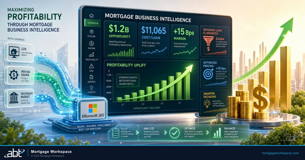
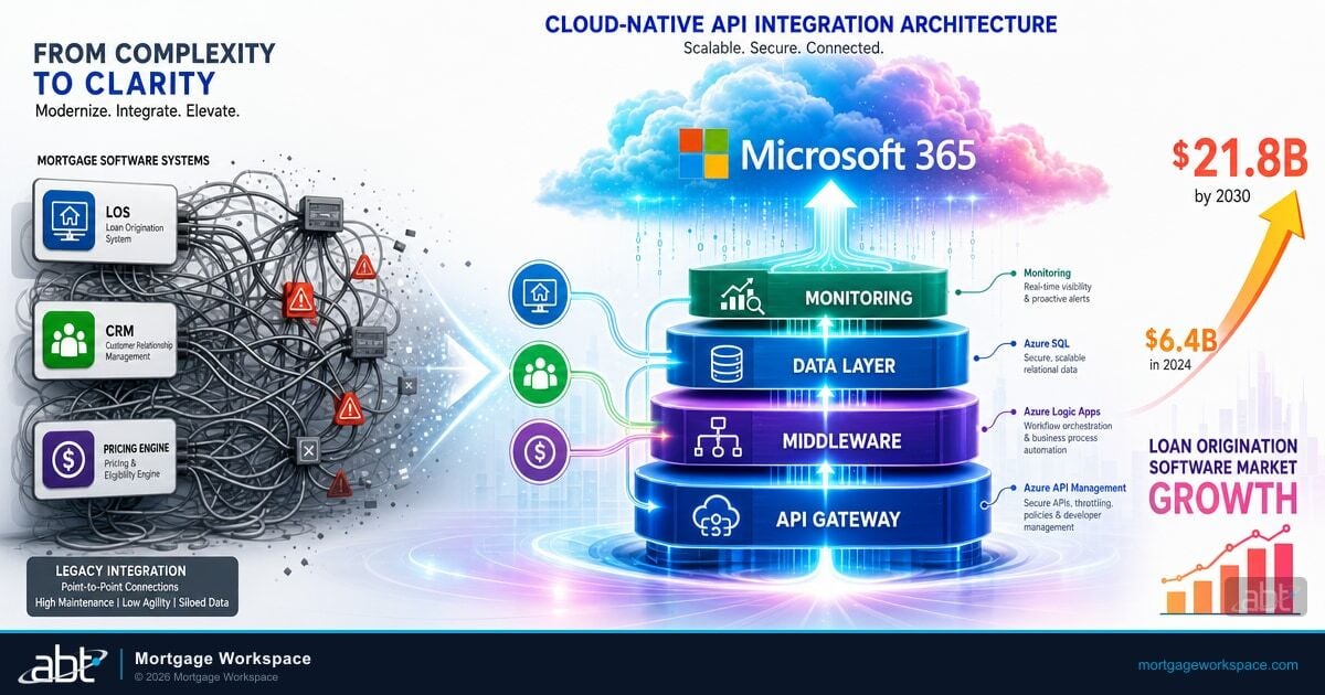
Mortgage BI and MortgageExchange: A Purpose-Built Mortgage Data Stack
Generic Power BI works, until it doesn't. The moment a mortgage shop tries to combine origination data from Encompass with servicing data from a sub-servicer with escrow disbursement records from a tax service provider with county-level reassessment data, the off-the-shelf BI tool becomes a part-time job for someone who already has a full-time job. The hand-off between data engineering and dashboard design swallows most internal Power BI projects before they reach a borrower.
Mortgage BI is Mortgage Workspace's purpose-built business intelligence layer for mortgage portfolios. It is not a rebranded Power BI dashboard. It is a productized analytics stack with pre-built data models for loan composition, pipeline performance, escrow exposure, combined tax and payment projections, and referral pattern analysis, all calibrated to the way independent mortgage banks, broker shops, and hybrid originators actually run a book. Loan officers open Mortgage BI to a borrower-conversation view that already shows the combined tax-plus-payment trend for the loan in front of them. Branch managers open it to a pipeline view that flags loans with rising escrow exposure before the borrower calls. The dashboards are configured once, deployed across the shop, and refreshed automatically as the underlying data updates.
MortgageExchange is the data layer that feeds Mortgage BI. It is the interface infrastructure that connects loan origination systems (Encompass, Byte, MeridianLink, Calyx PointCentral), sub-servicer and warehouse partners, tax and escrow service providers, and county-level data sources into a single queryable source. Every borrower record carries its full picture in one place: current note rate, current escrow balance, historical tax bills, historical insurance premiums, and the projected forward curve. Mortgage BI reads from MortgageExchange. The shop reads from Mortgage BI. The data plumbing problem that kills most internal Power BI rollouts is solved by the time the loan officer opens the dashboard.
The reason Mortgage Workspace's Mortgage BI deploys in weeks instead of quarters is that MortgageExchange has been moving data between mortgage origination systems and downstream platforms for more than two decades, against every major LOS and every major servicer. That interface footprint is the moat. A broker or independent mortgage bank does not need to stand up a parallel analytics team. Mortgage Workspace manages the Microsoft 365 tenant where Mortgage BI runs and operates the MortgageExchange data layer that connects to your origination and servicing partners.
See Mortgage BI configured against your own loan data
Mortgage Workspace configures Mortgage BI on top of MortgageExchange against your origination system, your servicer feeds, and your tax and escrow disbursement data. The borrower-conversation dashboard is live in weeks. Inside the Microsoft 365 tenant we already manage for mortgage shops like yours.
Turning Data Into Better Client Conversations
The visualization is the tool. The conversation is where the value lands. Here is how forward-looking mortgage shops actually use Mortgage BI across the loan lifecycle.
The three conversations that matter
At application. Show the borrower their projected total payment over five, ten, and 30 years under conservative, moderate, and aggressive escrow growth scenarios. Set expectations at the moment of decision, not after the first escrow analysis surprise.
At closing. Walk through the dashboard one more time. Confirm the borrower understands their payment will change. Document the conversation in your loan record. This is the moment that prevents the "you never told me" call fourteen months later.
At annual escrow review. Pull up the dashboard with actual versus projected data. Show where their escrow landed compared with the estimate. If the county reassessed, walk through the impact. This turns a reactive complaint call into a proactive, advice-led check-in that earns the refinance and the referral.
Originators who have adopted this approach report stronger borrower retention at refinance, more referrals from satisfied clients, and fewer "I want to speak to your manager" calls in the second year. The pattern is consistent: borrowers who feel informed at year zero do not blame their loan officer at year five.
For loan officers who want to extend the same data-driven approach to other parts of the mortgage conversation, our piece on data-driven learning dashboards for mortgage education covers self-service tools borrowers can revisit between meetings, and the visualizing mortgage amortization in Excel guide is a good starting point if you want to prototype the model before investing in a full Mortgage BI deployment.
How Mortgage Workspace Builds These for Lenders
Mortgage Workspace has built Microsoft-native technology infrastructure for mortgage lenders for more than 27 years. We are a Tier 1 Microsoft Cloud Solution Provider with direct Microsoft support access, and we serve more than 750 financial institutions across the United States including independent mortgage banks, broker shops, hybrid LO operations, and the banks and credit unions that originate mortgages. Our Mortgage BI and MortgageExchange teams configure the dashboard against your origination system, your servicer feeds, and your tax and escrow data, then train your loan officers to use it in real client conversations.
Because we work across the full mortgage vertical, MortgageExchange has been built and battle-tested against data from Encompass, Byte, MeridianLink, Calyx PointCentral, and the major sub-servicers and warehouse partners mortgage shops actually use. We know the data structures, the integration constraints, and the dashboard layouts that loan officers actually use in front of a borrower. The shop gets a borrower-conversation dashboard in weeks instead of standing up a parallel analytics team.
Give your borrowers a clear view of their total cost of ownership
Mortgage Workspace configures Mortgage BI on top of MortgageExchange inside the Microsoft 365 tenant we already manage for mortgage shops like yours. Built for the conversations loan officers have at application, closing, and annual review.
Frequently Asked Questions
Property taxes climbed roughly 20% and homeowners insurance climbed 41% between 2019 and 2024, per the National Association of Realtors 2025 Escrow Effect study, and Bankrate reports insurance is up close to 70% since 2021. Loan officers and mortgage brokers need visualizations that separate variable escrow components from fixed principal and interest so borrowers can see how their total monthly cost will move over the life of the loan, not just at the next escrow analysis. Mortgage Workspace's Mortgage BI dashboard, fed by the MortgageExchange data layer, is built specifically for that combined view.
Standard Power BI is a general-purpose business intelligence tool. The shop has to design the data model, connect to each upstream system separately, build dashboards from scratch, and maintain them as systems change. Mortgage BI is Mortgage Workspace's purpose-built layer on top of that toolset, with pre-configured data models for combined tax and payment trends, pipeline performance, escrow exposure, and referral pattern analysis, plus a MortgageExchange-fed data layer that already understands the structure of Encompass, Byte, MeridianLink, and Calyx PointCentral. The shop gets a borrower-conversation dashboard configured against its own data in weeks instead of standing up a parallel analytics team.
County assessor records provide current assessed values and tax rates per property. State departments of revenue publish historical tax rate changes by municipality. State insurance department filings and carrier rate filings provide premium trend data. Tax service providers and escrow administrators provide disbursement records. MortgageExchange ingests these sources alongside loan origination and servicing data into a governed data layer that Mortgage BI reads from, so loan officers in Florida see Florida-specific tax projections and originators in Texas see Texas data without each branch building its own model.
Yes. MortgageExchange has been built and battle-tested against Encompass, Byte, MeridianLink, Calyx PointCentral, and the major sub-servicers and warehouse partners that mortgage shops actually use, over more than two decades of mortgage-vertical deployments. Once connected, the data layer pulls current loan data automatically and applies configured growth assumptions, then feeds Mortgage BI dashboards that loan officers use during borrower consultations. Most shops set up daily refreshes so the dashboard always reflects current pipeline and servicing data.
The 2025 Lereta Escrow Awareness Survey found that 55% of homeowners had been surprised by a payment increase in the past two years and 45% still believed a fixed-rate payment cannot change. Visual dashboards inside Mortgage BI that show year-over-year escrow growth projections at application, closing, and annual review set realistic expectations and reduce the payment shock that drives borrowers to refinance with a competitor. The MortgageExchange data layer that feeds Mortgage BI also writes parameter values used in those conversations back to the loan record, giving the shop a documented trail of the borrower-facing disclosures and a reason for the borrower to call you first when they are ready to refinance.
Yes. The deployment model is built for shops that do not run a dedicated analytics team. Mortgage Workspace manages the Microsoft 365 tenant where Mortgage BI runs as a Tier 1 Cloud Solution Provider, operates the MortgageExchange data layer that connects to your origination system and servicer feeds, configures the borrower-conversation dashboards against your specific data, and trains your loan officers to use them. The shop opens a dashboard. The data plumbing is solved by the time the loan officer sits down with a borrower.