In This Article
- What Is Presumption of Compliance?
- Why Power BI for Compliance Tracking
- Mortgage BI on Top of the MortgageExchange Data Layer
- Template 1: Qualified Mortgage Checklist Dashboard
- Template 2: DTI and Pricing Risk Monitor
- Template 3: Pipeline Stage Compliance Tracker
- Template 4: Audit-Ready Evidence Report
- Microsoft Purview Audit and M365 Guardian as the Compliance Evidence Layer
- Implementation Steps
- Frequently Asked Questions
Fannie Mae Updated QM Delivery Edits in January 2026. Are Your Dashboards Keeping Up?
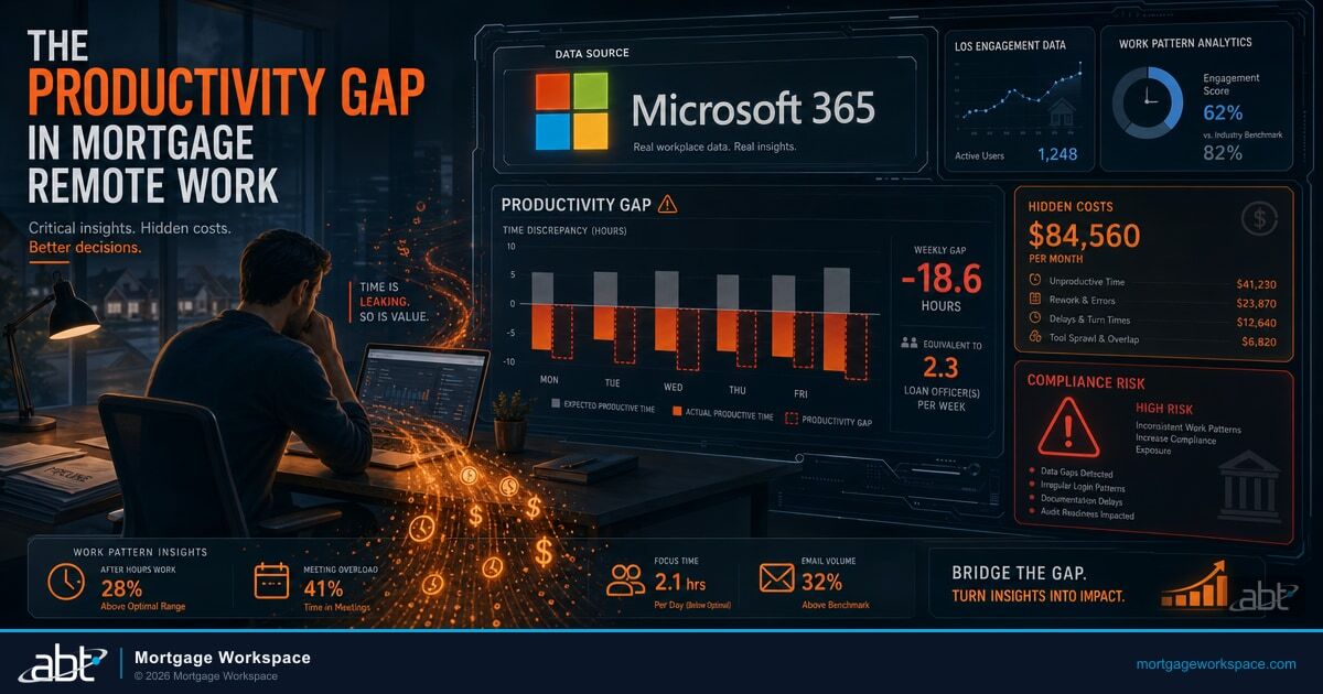
Fannie Mae updated its Qualified Mortgage delivery edits on January 5, 2026, adding tighter validation on APR-to-APOR spreads, points-and-fees thresholds, and UCD data accuracy. Loans that fail these edits cannot be delivered. For lenders tracking QM status in spreadsheets, that means finding out a loan is non-deliverable after it has already funded. Power BI changes that equation. By pulling loan origination data into real-time dashboards, compliance teams can flag QM threshold violations before loans close. With the 2026 HOEPA triggers, points-and-fees caps, and APR spreads all updated for the new year, manual tracking is no longer viable at scale.
The harder problem is not the dashboard itself, it is the data layer underneath. Lenders that try to visualize compliance from raw LOS exports spend most of their time normalizing field names, joining borrower and loan tables, and reconciling APR figures that move every time a re-disclosure happens. Access Business Technologies operates Microsoft 365 tenants for 750+ financial institutions, and the mortgage lenders inside that footprint run their compliance dashboards on Mortgage BI sitting on top of the MortgageExchange data layer. Power BI is the visualization surface. MortgageExchange and Mortgage BI are what make the surface trustworthy.
Why ABT Runs Compliance Dashboards for Mortgage Lenders
- MortgageExchange normalizes LOS data across Encompass, Byte, and Calyx so QM, HOEPA, and HMDA metrics compute from a single canonical schema rather than from raw vendor-specific exports.
- Mortgage BI ships pre-built presumption-of-compliance dashboards calibrated to Fannie Mae's January 2026 delivery edits, the 2026 HOEPA triggers, and the asset-size exemption thresholds CFPB updated for the year.
- Microsoft Purview Audit and M365 Guardian produce the time-stamped evidence trail that CFPB examiners, internal audit, and state regulators expect to see when they ask how the dashboard numbers were calculated and who accessed them.
This guide walks through four Power BI dashboard templates built for presumption-of-compliance tracking, explains where the Mortgage BI plus MortgageExchange data layer fits in, and shows how Microsoft Purview Audit and M365 Guardian carry the dashboard evidence into a defensible compliance posture for CFPB and regulatory exams.
What Is Presumption of Compliance?
Presumption of compliance protects mortgage lenders from ability-to-repay (ATR) lawsuits when a loan meets Qualified Mortgage (QM) standards. There are two levels of protection. Safe harbor applies to loans priced at or below the APR-to-APOR threshold and gives the lender conclusive presumption of compliance. The borrower cannot challenge the lender's ATR determination. Rebuttable presumption applies to higher-priced QM loans and gives weaker protection. The borrower can challenge the ATR determination, and the lender must prove compliance through documentation. We cover TRID Compliance IT Checklist for Mortgage Lenders in a companion piece.
The QM criteria that drive this determination include the debt-to-income ratio, total points and fees relative to the loan amount, the loan term, the absence of risky features such as negative amortization or interest-only payments on standard QMs, and the completeness of income and asset verification through reliable third-party sources. Every loan a lender originates should be assessed against these criteria before closing. Power BI makes that assessment visible, automated, and auditable. Mortgage BI makes it pre-wired for the regulatory rules CFPB examiners actually grade against.
Why Power BI for Compliance Tracking
Spreadsheets break down when a lender is originating 50 or more loans per month. Formulas get overwritten. Versions conflict. Nobody trusts the numbers during crunch time. Power BI solves these problems with live data connections directly from the LOS, automated APR-to-APOR and points-and-fees calculations that recompute in real time as loan data updates, visual color-coded dashboards that surface loans approaching or exceeding QM thresholds before they close, and role-based access so underwriters see their pipeline, compliance officers see the full picture, and branch managers see only their branch.
Power BI is already included in Microsoft 365 Business Premium and E5 licenses. The tool is available. The question is whether the compliance team is getting clean data into it, and whether the resulting dashboards are tied to the evidence layer that satisfies an examiner.
Mortgage BI on Top of the MortgageExchange Data Layer
The reason Power BI compliance dashboards stall inside lenders is rarely Power BI itself. The bottleneck is the data layer. Encompass, Byte, and Calyx each store APR, points, fees, borrower income, and DTI in their own field names, normalization rules, and historical-update semantics. A team that tries to wire Power BI directly to one of those LOS platforms spends weeks reconciling field shapes before the first dashboard ever loads.
MortgageExchange solves that. MortgageExchange is the custom interface ABT operates between the lender's LOS and the broader Microsoft 365 and Azure data fabric. It normalizes loan, borrower, application, and disclosure data into a canonical schema, captures historical change records so APR re-disclosures and points-and-fees recalculations are visible in the audit trail rather than overwritten in place, and feeds that schema into the Mortgage BI semantic layer. Mortgage BI then exposes pre-built measures for HMDA, ECOA, TILA, RESPA, and the 2026 HOEPA triggers as native Power BI calculations. The compliance team builds dashboards against measures named the way the regulation reads, rather than against vendor-specific raw fields.
The HMDA loan-application register, the ECOA notice-of-action-taken timelines, the TILA APR-to-APOR spread, the RESPA disclosure-delivery clock, and the QM points-and-fees percentage all compute from the same canonical schema. When CFPB asks how the lender knows a given loan was within the 5 percent points-and-fees cap, the answer is the Mortgage BI measure, computed from the MortgageExchange canonical record, with the underlying field-level history preserved in the data layer for the examiner to inspect.
Template 1: Qualified Mortgage Checklist Dashboard
This dashboard provides a real-time snapshot of every loan's QM status across the pipeline. The components include a donut chart showing the percentage of loans categorized as safe harbor, rebuttable presumption, and non-QM, which gives leadership a one-glance risk view. A bar graph compares points-and-fees against the threshold for each loan-amount tier with loans approaching the cap highlighted in yellow and those exceeding it in red. A scatter plot maps the APR-to-APOR spread against loan amount so cluster analysis reveals pricing patterns that may warrant underwriting review. A data grid lists each loan with pass and fail icons for every QM criterion and drills into any loan to show the specific data driving the assessment. A trend line tracks the QM compliance rate over time, where a declining trend signals process issues before they become systemic.
Template 2: DTI and Pricing Risk Monitor
This dashboard focuses on the two metrics that cause the most QM failures: the DTI ratio and the pricing thresholds. A DTI distribution histogram shows where the pipeline clusters relative to the general QM threshold, with loans above 43 percent DTI under the general QM definition needing alternative QM qualification or non-QM treatment. A pricing heat map visualizes APR spread across loan types, terms, and branches, which identifies which products or branches produce higher-priced loans that receive only rebuttable presumption. An alert panel flags loans where DTI exceeds 40 percent or pricing spread approaches the higher-priced threshold, which gives underwriters time to restructure before closing. A branch comparison shows side-by-side DTI and pricing distributions by branch and reveals whether specific offices consistently produce riskier loan profiles.
Template 3: Pipeline Stage Compliance Tracker
This dashboard tracks compliance health across origination, underwriting, and closing stages. A funnel visualization shows how many loans pass QM checks at each pipeline stage, where a narrowing funnel reveals where compliance issues concentrate. An SLA tracker monitors time from application to QM assessment completion, since delays in compliance review can bottleneck the pipeline. A condition clearance grid tracks open QM-related conditions by loan, with conditions like missing income verification or unresolved DTI calculations appearing with age indicators. A stage-over-stage comparison compares this month's stage-level compliance to the previous month so trends reveal whether process improvements are working. This connects closely to Navigating Compliance Challenges in Mortgage Management.
Template 4: Audit-Ready Evidence Report
This report template generates examiner-ready documentation for individual loans or portfolio segments. A loan-level QM summary provides a one-page view showing every QM criterion with pass and fail status, supporting data, and source documentation references. A portfolio compliance snapshot shows aggregate statistics by product type, branch, loan officer, and time period. An exception log documents every loan that required QM remediation, the issue found, the corrective action taken, and the resulting QM status. PDF and Excel exports are formatted for examiner review and include data sources, calculation methodology, and the timestamp of report generation.
Microsoft Purview Audit and M365 Guardian as the Compliance Evidence Layer
A clean dashboard is not the same as a defensible audit position. Examiners from CFPB, state regulators, and internal audit do not just look at the dashboard number. They ask how it was calculated, what changed in the source data over the loan's life, who accessed it, and whether the report could have been altered between generation and delivery. That is where Microsoft Purview Audit and M365 Guardian carry the dashboard evidence into a defensible compliance posture.
Microsoft Purview Audit captures the time-stamped record of who accessed which Power BI report, who exported it, who modified the underlying dataset, and who changed sensitivity labels on the resulting file. Purview Audit Premium extends that retention to one year, and with the add-on, up to ten, which aligns with the multi-year recordkeeping windows CFPB and state regulators expect on mortgage-compliance evidence. Retention policies bind tamper-evident retention to the SharePoint sites, OneDrive accounts, and Teams channels where compliance reports actually live. Sensitivity labels mark the QM evidence and HMDA submissions so they are tracked, encrypted, and protected from accidental disclosure across the lender's Microsoft 365 footprint.
M365 Guardian is ABT's operating model on top of those Microsoft controls. For a mortgage lender, M365 Guardian includes lender-specific Conditional Access policies tuned to branch geography and loan-officer behavior, mortgage-specific data loss prevention covering borrower NPI and HMDA data, retention policies aligned to CFPB and state recordkeeping rules with documented testing of restore and production workflows, a Microsoft Sentinel deployment tuned to mortgage-industry attack patterns, and the 24/7 security operations center that watches the Sentinel and Defender signals every minute of the day. When CFPB asks for the audit trail behind a presumption-of-compliance assertion, ABT produces it from Purview Audit and Sentinel under the M365 Guardian operating model, with the underlying loan data sourced from MortgageExchange and rendered for the examiner through Mortgage BI.
A CFPB exam opens. The examiner asks for the QM compliance evidence for 240 loans across the prior 18 months, including who calculated the points-and-fees, who reviewed it, and the source data behind every APR-to-APOR spread. The compliance team pulls Power BI screenshots. Two LOS exports do not match. Three reports are missing audit history. The exam stretches.
The same exam opens. ABT pulls the Mortgage BI dashboard exports, the MortgageExchange canonical record history, and the Microsoft Purview Audit access trail in one consolidated package. Sensitivity labels and retention policies confirm the evidence has not been altered since generation. The exam closes on time with no finding on this surface.
Implementation Steps
Step 1: connect the data source. Power BI supports direct connections to Encompass, Byte, Calyx, and most LOS platforms through ODBC, API, or Excel export. Lenders running on MortgageExchange skip this step because the canonical schema is already populated and refreshed.
Step 2: build with sample data first. Use anonymized loan data to build and test dashboards. Validate calculations against known QM outcomes before connecting live data.
Step 3: involve the compliance team early. Compliance officers know what examiners ask for. Build dashboards that answer those questions directly. The Mortgage BI semantic layer ships those answers pre-wired, but every lender has variations the compliance team needs to confirm.
Step 4: set up automated refresh. Schedule data refreshes to match pipeline velocity. High-volume shops need hourly refreshes. Smaller operations can use daily.
Step 5: publish to Power BI Service. Deploy dashboards to the Power BI workspace so compliance teams, underwriters, and managers can access them from any device. Apply row-level security to restrict views by role. Sensitivity labels from Microsoft Purview Information Protection should be applied at this stage so the evidence trail is in place before the first export leaves the workspace. For ABT's fuller take, see DLP and the Role of Technology in Modern Mortgage Compliance.
Step 6: update thresholds annually. Every January, update dashboard parameters with the new year's HOEPA triggers, points-and-fees caps, APR-to-APOR spreads, and asset-size exemption thresholds. The 2026 updates are already in effect. When the dashboards run on Mortgage BI, the threshold updates are part of the semantic-layer release, so the compliance team does not have to chase them across individual reports.
Key Takeaway
Power BI alone is a visualization surface. Mortgage BI on top of the MortgageExchange data layer is what makes the surface trustworthy across the HMDA, ECOA, TILA, RESPA, and QM rule set. Microsoft Purview Audit, retention policies, and M365 Guardian carry that trustworthiness into a defensible position for CFPB and regulatory exams. A Tier-1 Cloud Solution Provider applies and monitors the configuration so the compliance team walks into an exam with the dashboard, the data, and the evidence trail already aligned.
Get a Mortgage Compliance Dashboard Readiness Review
ABT runs the Mortgage BI plus MortgageExchange data-layer pattern described in this article for mortgage lenders preparing for CFPB exams, internal audit cycles, and state-level recordkeeping reviews. A 30-minute conversation maps your current LOS, dashboard, and evidence-layer setup, surfaces the gaps your next examiner is most likely to find, and outlines what an ABT-managed deployment would cover. No commitment, no quote, no obligation.
Frequently Asked Questions
Presumption-of-compliance metrics are loan attributes that determine whether a mortgage qualifies for safe harbor or rebuttable presumption protection under federal ability-to-repay and Qualified Mortgage rules. Key metrics include the debt-to-income ratio, total points and fees relative to loan amount, APR-to-APOR spread, loan term, amortization type, and income verification completeness. In a Mortgage BI dashboard built on the MortgageExchange data layer, these metrics compute from a canonical schema so QM, HOEPA, and HMDA rules all reference the same underlying record.
Yes. Power BI connects directly to loan origination systems through ODBC, API, or file-based imports. With automated data refreshes, dashboards display current QM compliance status for every loan in the pipeline. Visual alerts flag loans approaching or exceeding thresholds before they reach closing, giving compliance teams time to address issues. Lenders that route LOS data through MortgageExchange first get a normalized schema, so dashboard measures compute from the same canonical record across Encompass, Byte, and Calyx without per-LOS rework.
Fannie Mae updated its QM delivery edits on January 5, 2026, with stricter validation of APR-to-APOR spreads, points-and-fees calculations, and UCD data accuracy. Loans failing these edits cannot be delivered for purchase. The 2026 HOEPA triggers, points-and-fees thresholds, and the CFPB-updated asset-size exemption are all in effect. The Mortgage BI semantic layer ships those threshold updates as part of the release cycle so compliance teams do not have to chase them across individual reports.
Microsoft Purview Audit captures the time-stamped record of who accessed which Power BI report, who exported it, who modified the underlying dataset, and who changed sensitivity labels on the resulting file. Purview Audit Premium extends retention to one year and, with the add-on, up to ten, which aligns with the multi-year recordkeeping windows CFPB and state regulators expect on mortgage-compliance evidence. M365 Guardian is ABT's operating model on top of Microsoft Purview, Defender, Sentinel, and Entra ID, and it includes mortgage-specific data loss prevention, retention policies aligned to CFPB and state recordkeeping rules, and the 24/7 security operations center that watches the signals every minute of the day.
Power BI dashboards produce examiner-ready documentation including loan-level QM summaries, portfolio compliance snapshots, exception logs, and trend analysis. Reports can be exported as PDF or Excel files with calculation methodology and timestamps. Having dashboard evidence readily available reduces audit preparation time and demonstrates proactive compliance monitoring. When the dashboards run on Mortgage BI with MortgageExchange as the data layer and the resulting evidence is captured under Microsoft Purview Audit and the M365 Guardian operating model, the examiner gets the calculation, the source, and the access trail in one defensible package.